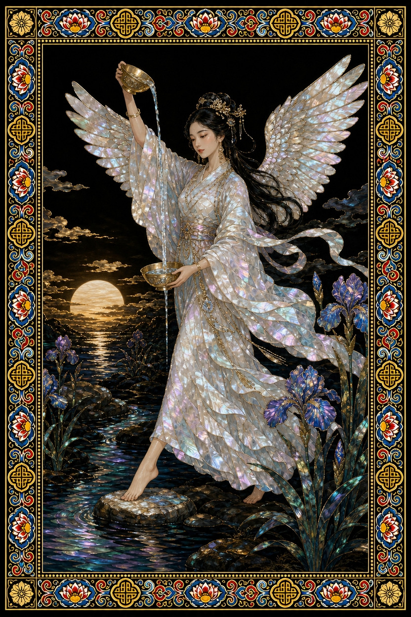
Major Arcana · Temperance
Temperance — The Winged Woman Pouring Water Between Two Cups
Why does the woman pouring water between two cups never tip to one side? This essay follows the details of the painting and argues that temperance is not a matter of endurance but a skill of blending.
『Temperance』 — what this card actually draws
A winged woman stands at the centre of the image. The hem of her white robe trails long to her feet, and each hand holds a golden vessel. The left vessel is held low and the right one high, so that a difference in height opens between them.
The eye follows that difference down the stream of water. The woman is pouring from one vessel into the other, and the water is drawn not as something that merely falls but as a single current linking the two cups. Near her feet stand irises, and close to the horizon the sun hangs low.
The background is empty. Apart from the figure, the flowers, and the sun there is nothing to catch the eye, so the gaze drifts back and forth between the two vessels. That back-and-forth is the first impression the card gives.
Symbols and meaning
Pouring water from one vessel to another looks like emptying one side to fill the other, but it is really the skill of adjusting so that neither cup runs dry. Pour too much at once and it overflows; pour too little and it runs dry. The balance and patience that Temperance speaks of upright come close to this sensation at the fingertips. A state in which different things are blended without either one disappearing — that is the harmony this image points to.
The wings suggest that this adjustment is not only a matter of staying grounded. Irises have long been read as a symbol of purification and healing, and the low sun shows the gentle hour before a day ends. This is not the hasty heat of noon but the temperature of an afternoon that ripens as it slowly cools.
When read reversed, the centre is excess. Tilt the vessel too far and all the water spills; let the hand grow impatient and friction arises between the two cups. Overcorrection grows from the same root. When the wish to balance goes too far and tries to control everything, the flow itself is what gets blocked.
When this card appears
At work it can read as a signal to slow down. Rather than pouring yourself into several tasks at once, check how full the vessel in your hand actually is. In relationships it shows up as a question of regulating emotional temperature. If you take a moment to decant before you pour everything out, the texture of the conversation changes.
With money it reads as a warning against extreme choices. Rather than putting everything into one place or emptying it all out, a distribution that is poured a little at a time suits this card. In a decision, it becomes a suggestion to look for a third angle that abandons neither side completely.
In a reading it might arrive as a sentence like this: "What you need now is not to pour more, but to level the height of the vessels."
History and culture: dancheong — the five colours of timber painting
Applying colour to wooden architecture is more than decoration. It is a preservation technique that protects the timber from insects and damp, and at the same time a device that reveals a building's rank and signals the character of a space. Dancheong (traditional polychrome painting on timber) is therefore less about applying colour than about arranging it.
Obangsaek (the five cardinal colours) assigns each direction its role. Blue for the east, red for the south, white for the west, black for the north, and yellow for the centre each keep their place without pressing on one another. Pattern units such as meoricho and hongchang are composed on the same principle. Strong colours and pale ones alternate so that no single colour swallows the whole surface.
Laying the Temperance image over this grammar produces an interesting point. The water flowing between the two vessels acts as a boundary line joining colour to colour, while the irises and the low sun divide the top and bottom of the image and hold the balance. Just as dancheong achieves harmony by setting colours side by side rather than mixing them, this card does not merge the two vessels into one but keeps the space between them open.
Common misreadings
Temperance is often read only as a card of enduring and suppressing desire. But the woman in the painting is discarding nothing. Both vessels are still in her hands, and the water does not vanish — it is only moved. Temperance is not abstinence but apportionment.
Another misreading takes this card to mean a permanently gentle neutrality. The friction that the reversed card speaks of may in fact be a sign that a relationship is genuinely moving. The problem is not the existence of conflict but the impatience that pours it all out at once.
Finally, balance is sometimes taken to mean splitting things perfectly in half. The two vessels in the painting are different heights. Read balance not as a state of equal division but as an ongoing process of pouring just as much as this moment needs.
Draw a card yourself
The picture you have just read can be placed against your own question. The same card answers differently when the question changes.
- A deck drawn in-house — 78 cards in the colours of nacre and dancheong
- Readings that read the picture, not a keyword list
- Keep asking — draw one more card for your next question
- A record you can return to and compare
- Let a friend draw for you with a single link
- Seventeen languages, one deck, one reading
More from this suit
